Candlesticks charts are one of the most efficient ways to analyse the change in the prices of an asset. They show us the direction in which the prices are moving during a particular period.
Candlestick charts are a type of technical charts which are used to analyse the further movement of the prices just like the bar charts or line charts.
To learn about technical charts and indicators, in brief, you can take up: Certification in Online Technical Analysis
Candlestick charts are more visually appealing than the bar and line charts, as each candlestick shows the completion of a specific number of trades during a particular period.
It also shows whether there was more selling or buying pressure during that particular period.
Let us discuss in details candlestick charts and how to analyse them while trading:
Origin of Candlesticks
Japanese candlestick charts are the oldest type of charting technique used to analyse the future price movement.
In the 1700s, the earliest forms of candlestick charts were used to predict rice prices.
In 1750, a Japanese merchant by the name of Munehisa Homma started using his candlestick analysis to trade at the Rice exchange at Sakata.
Suggested Read: All you need to know about the Japanese Candlestick
Formation
Each candlestick is mainly made up of real bodies and wicks also known as shadows or tails.
Real Body:
The real body is the most important part of candlestick as it reflects the difference between the open price and closing price of the particular timeframe, say a day, week, month, and so on.
Open Price:
The top or the bottom of the candlestick represents the opening price.
If the opening price of the asset is more than then the closing price, then the open will be at the top of the candlestick body. This shows that the prices were in a downtrend and the colour of the candlestick will be either red or black.
If the opening price of the asset is less than then the closing price, then the open price will be at the bottom of the candlestick body. This shows that the prices were in an uptrend in that timeframe and the colour of the candlestick will be either green or white.
Close Price:
Similarly, like the opening price, the closing price is either at the top or bottom of the candlestick body.
If the closing price is more than the opening price, then the close will be at the top of the candlestick body.
This shows that the prices were in an uptrend in that timeframe and the colour of the candlestick will be green or white.
If the closing price is less than the opening price, then the close will be at the bottom of the candlestick body.
This shows that the prices were in a downtrend in that timeframe and the colour of the candlestick will be red or black.
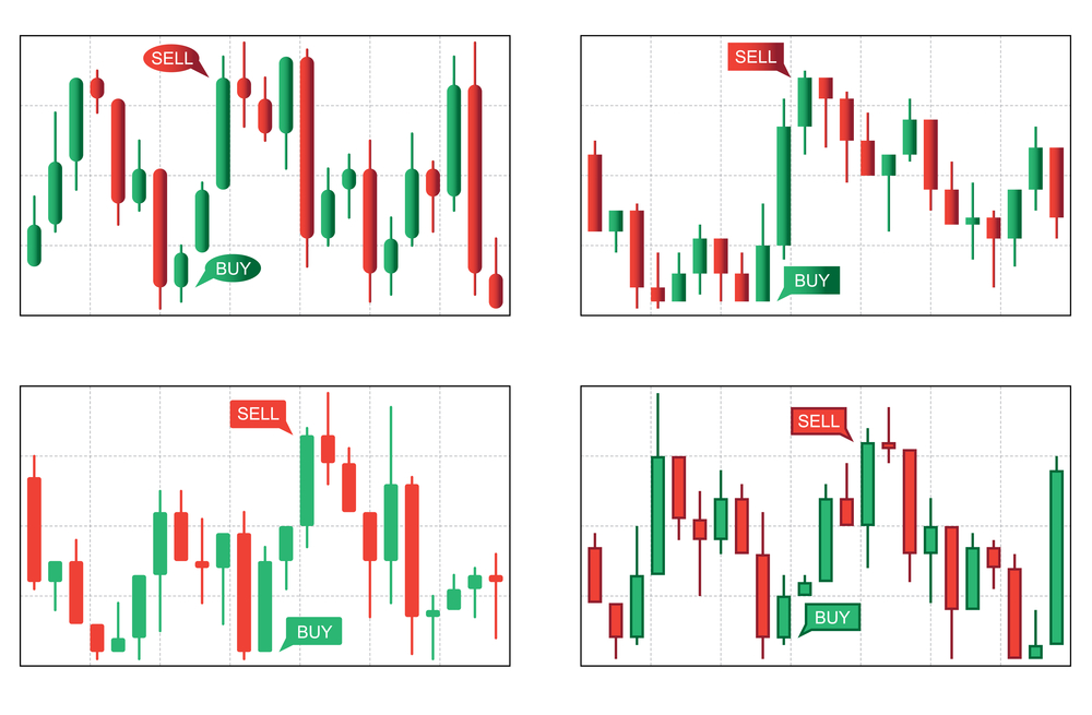
Nowadays traders usually use red and green candlestick charts as they visually depict whether there is buying pressure from the bulls or selling pressure by the bears. If the colour of the candlestick is green then it means that bulls were successful in raising the prices up and If the colour of the candlestick is red then it means that the bears were successful in pushing the prices down in that specific trading period as shown below.
2. Shadows:

The shadows are thin vertical lines above or below the real body of the candlestick which mainly reflects the highest and lowest prices that went during that trading timeframe. The upper shadows represent the highest price whereas the lower shadow represents the lowest price of that particular trading session.
High Price:
The high price during the specified timeframe is indicated by the top of the shadow above the body.
There will be no upper shadow if the open or close was the highest price.
Low Price:
The low price during the specified timeframe is indicated by the bottom of the shadow below the body.
There will be no lower shadow if the open or close was the lowest price.
Interpreting Patterns on Candlestick Charts:
As candlesticks are more appealing, the trader looks for candlestick patterns that can be continuation or reversal.
These candlestick patterns can also be classified into bearish and bullish candlestick patterns.
The candlestick patterns can be a single candlestick pattern or may be formed by grouping two-three candlesticks.
Some of the examples of such candlestick patterns are:
Example of single candlestick pattern:
Marubozu: The bullish or bearish marubozu pattern indicates a stock has traded strongly in one direction and closed at its high or low price of the particular trading session.
Doji: It is a candlestick pattern in which the opening and closing prices are the same or almost the same and indicates indecision in the market.
Spinning Tops: It is a candlestick pattern that has a short real body that is located in-between the upper and lower shadows indicating possible reversals to either side.
Hammer: This candlestick pattern indicates a bullish reversal and is formed at the end of a downtrend. It has a long lower shadow, the length of which is more than twice the real body.
Hanging man: This candlestick pattern indicates a bearish reversal and is formed at the end of an uptrend. It has a long lower shadow, the length of which is more than twice the real body.
Shooting star: This candlestick pattern indicates a bearish reversal and is formed at the end of an uptrend. It has a long upper shadow, the length of which is more than twice the real body.
Multiple candlestick patterns are formed by multiple candles.
Example of multiple candlestick patterns:
Bullish Engulfing- This candlestick pattern indicates a bullish reversal and consists of two candlesticks in which the second bullish candlestick engulfs the first bearish candlestick.
Bearish Engulfing- This candlestick pattern indicates a bearish reversal and consists of two candlesticks in which the second bearish candlestick engulfs the first bullish candlestick.
Harami
Bullish Harami- This candlestick pattern indicates a bullish reversal and consists of two candlesticks in which the real body of the second bullish candlestick is smaller than the first bearish candlestick.
Bearish Harami- This candlestick pattern indicates a bearish reversal and consists of two candlesticks in which the real body of the second bearish candlestick is smaller than the first bullish candlestick.
Piercing Pattern- This candlestick pattern indicates a bullish reversal in which the second bullish candlestick should close more than the middle point of the first bearish candlestick.
Dark cloud cover- This candlestick pattern indicates a bearish reversal in which the second bearish candlestick should close more than the middle point of the first bullish candlestick.
Morning Star- This candlestick pattern involves three candlesticks and indicates a bullish reversal.
Evening Star- This candlestick pattern involves three candlesticks and indicates a bearish reversal.
Assumption while analysing the charts
One should buy strength and sell weakness:
Strength is usually represented by a bullish (red) candle whereas weakness is represented by a bearish (red) candle.
One should usually buy a green candle day and sell it on a red candle day.
One should be flexible with patterns:
There could be minor variations to the pattern due because of market conditions.
Therefore, one should be a bit flexible when analysing these candlestick patterns on the charts.
One should look for a prior trend:
The prior trend should be bearish when looking for a bullish reversal candlestick pattern and similarly, the prior trend should be bullish if you are looking for a bearish reversal pattern.

For example, to spot a Bearish Harami candlestick pattern, the prior trend should be an uptrend as Bearish Harami is a bearish reversal candlestick pattern and indicates reversal to the downtrend.
Traders can use trading charting platforms like StockEdge, Investing.com etc. to use these candlestick charts for analysing the current ongoing price trend or price reversals.
The author is Founder of Stockedge & Elearnmarkets
DISCLAIMER: Views expressed are the author’s own, and Outlook Money does not necessarily subscribe to them. Outlook Money shall not be responsible for any damage caused to any person/organisation directly or indirectly.